Design System
Lead Product Designer • Float Health, Everee, Pluralsight
Building and scaling design systems across multiple product organizations
Scale product quality and delivery speed through design systems built with engineering, not just for engineering.
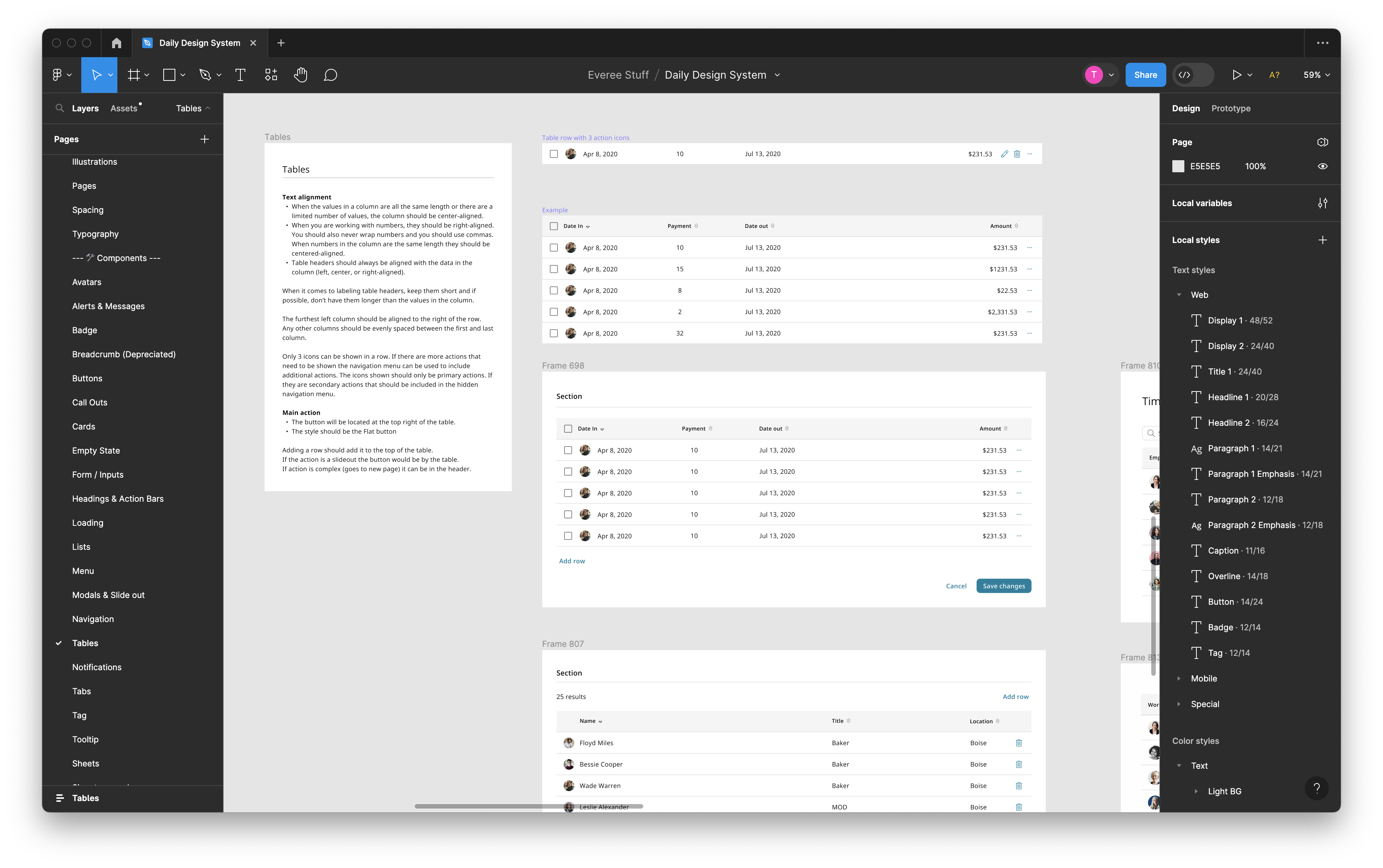
Across Float Health, Everee, and Pluralsight, the core challenge was consistent: product teams were moving quickly, but UI patterns and implementation details were drifting across squads. This created rework, inconsistent experiences, and slower releases.
My goal was to establish systems that connect strategy to execution: shared foundations, reusable components, clear governance, and a practical workflow between Figma and production code. Storybook became a central part of that workflow, giving design and engineering one place to review, document, and validate component behavior.
Discovery focused on where inconsistency and handoff friction were slowing delivery.
At each company, I started by mapping how design decisions turned into shipped UI. The biggest gaps were rarely visual-only issues; they showed up in unclear states, repeated implementation decisions, and missing shared ownership between product design and engineering.
- Same components implemented differently across teams and repositories
- Design files and production components diverged over time
- Unclear ownership for component quality, accessibility, and maintenance
Research centered on adoption: what teams actually use, trust, and maintain.
Instead of creating a theoretical system, I prioritized evidence from active product work. I audited high-volume flows, studied existing component usage, and partnered with engineers to identify where tokens, APIs, and interaction logic needed to be standardized first.
- Audited core journeys and measured pattern duplication and inconsistencies
- Prioritized components by product impact, implementation churn, and accessibility risk
- Aligned design tokens with front-end implementation constraints and theming needs
Designed systems that paired clear foundations with an implementation-first collaboration model.
The systems were structured around Brand, Foundations, and Components, but the key differentiator was process: design and engineering worked as partners from definition through implementation, not as separate handoff stages.
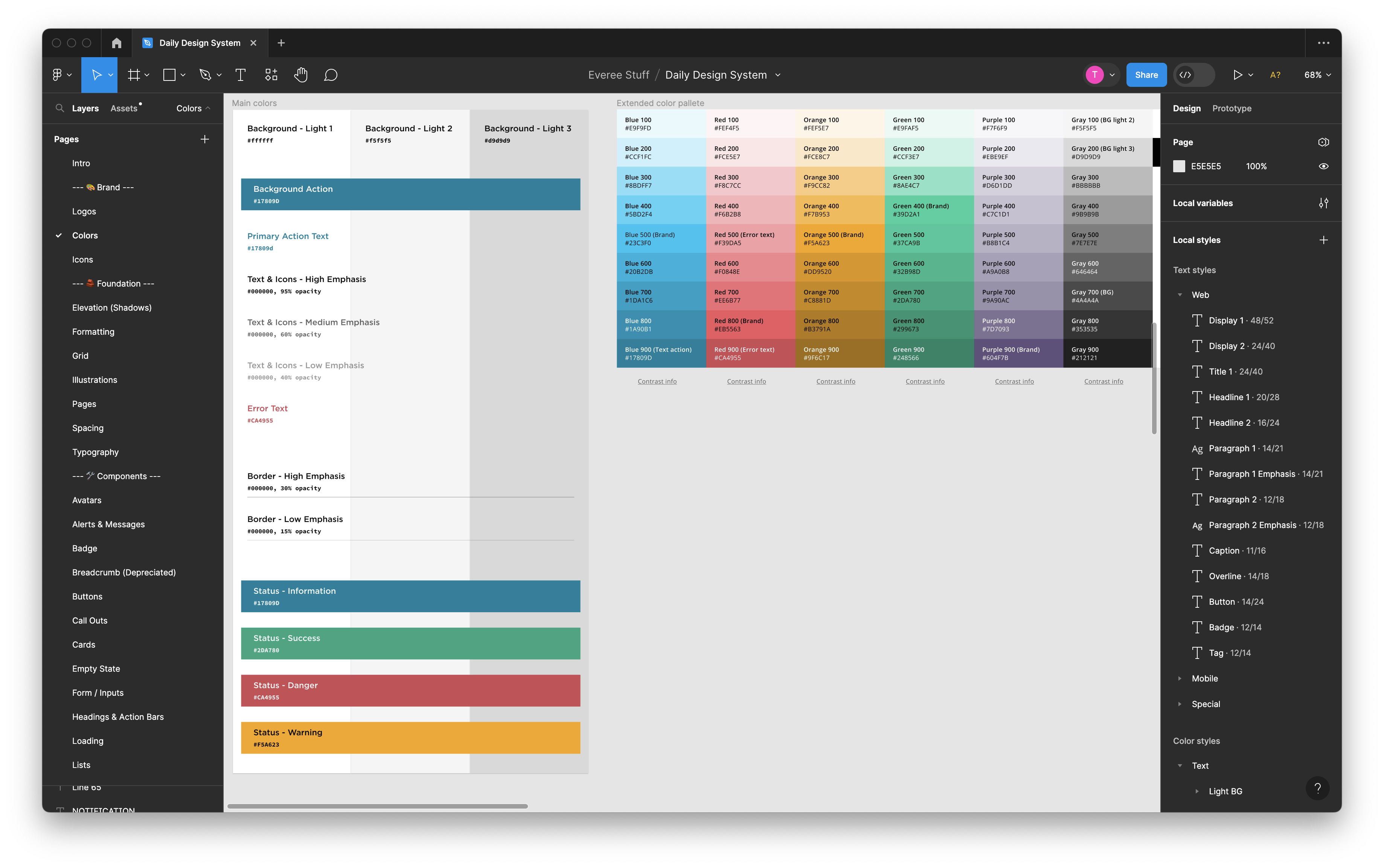
Brand established visual direction while keeping enough flexibility for product scale.
- Expanded color systems with accessible semantic roles and scalable usage rules
- Documented contrast requirements and practical UI application guidance
- Aligned visual language across marketing, product surfaces, and platform modules
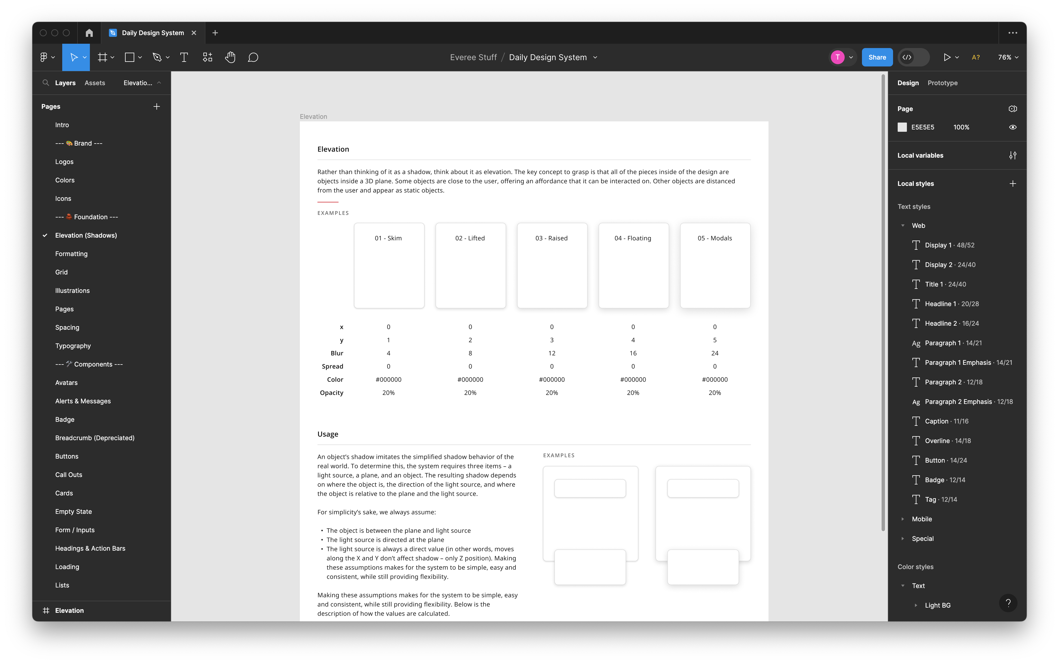
Foundations created consistency for typography, spacing, elevation, and data presentation across teams.
- Cross-platform type scales, spacing rules, and layout primitives
- State models for loading, error, empty, and success patterns
- Guidance for formatting complex data, time, and sensitive information
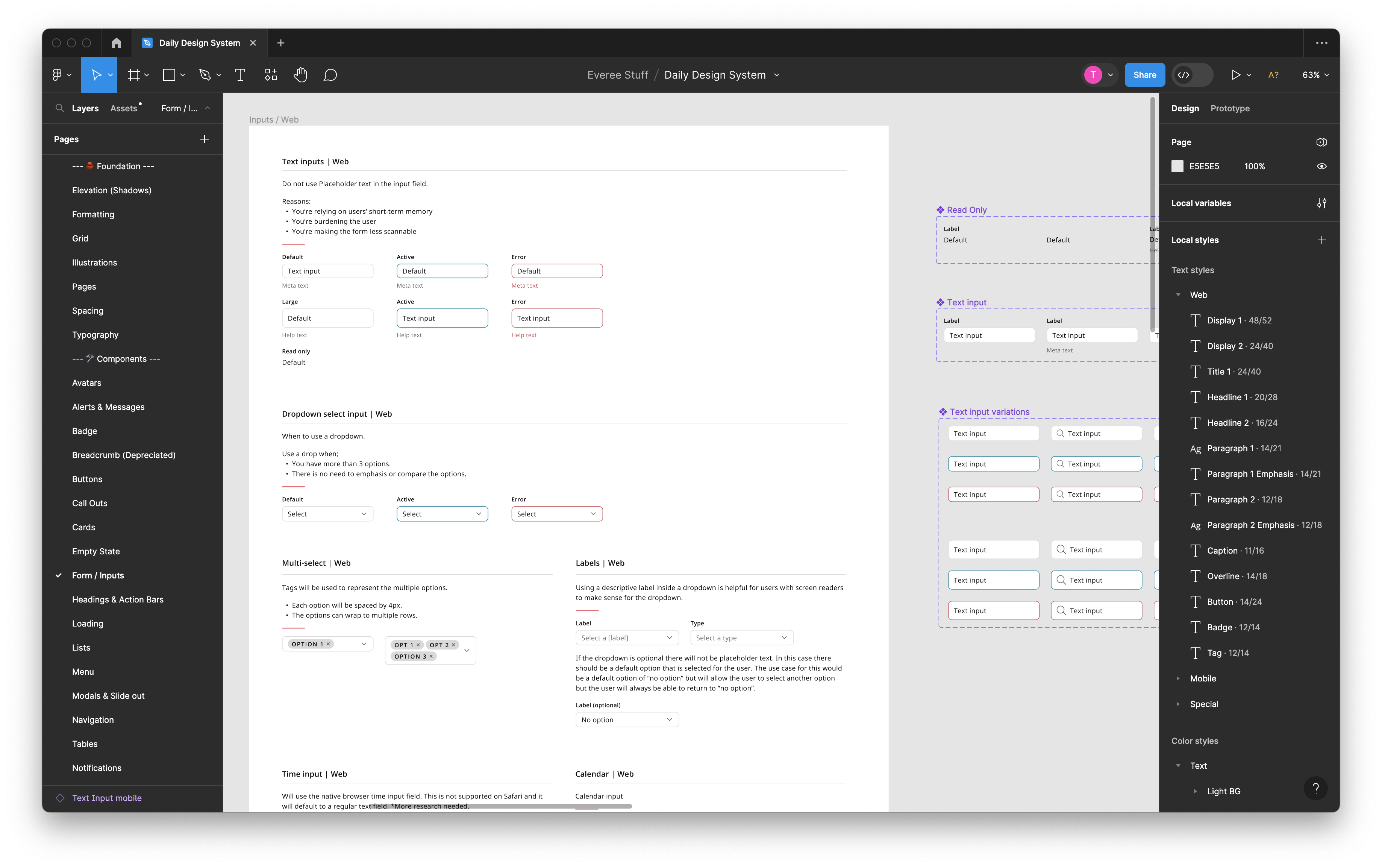
Components were built as a shared contract between design intent and production behavior.
- Defined APIs for core components and usage boundaries for variants
- Captured interaction behavior, accessibility expectations, and edge cases
- Improved consistency for forms, data tables, navigation, and feedback states
I partnered directly with front-end engineers to translate system decisions into stable implementation patterns. This included regular design-engineering working sessions, component API reviews, and governance checkpoints that kept the system practical for roadmap delivery.
- Co-defined tokens, naming conventions, and component state models
- Reviewed implementation details before and after release
- Used Storybook in pull request workflows to validate visual and behavioral consistency
Storybook became the operational hub for implementation quality and documentation. Figma remained the design source of truth, while Storybook provided live, testable, and versioned components that teams could rely on during build and review.
- Documented component anatomy, variants, and usage guidance in one place
- Used stories to review interaction states and regression risk
- Enabled faster onboarding for new designers and engineers
Outcomes improved consistency, delivery speed, and system maturity across organizations.
- Reduced duplicate design/dev effort through reusable, trusted component patterns
- Improved release confidence with clearer standards and documented states
- Increased design-engineering alignment around shared implementation language
- Float Health: built and managed a scalable system supporting rapid operational product growth
- Everee: established a systemized foundation that reduced UI drift across payroll workflows
- Pluralsight: contributed to system evolution through component consistency and cross-team alignment
Currently exploring how AI can accelerate system operations and team velocity.
I am actively experimenting with AI-supported workflows to help teams move faster while preserving quality and consistency. The focus is on practical use cases that reduce repetitive work and improve decision speed across design and engineering.
- Evaluating AI-assisted documentation to keep Storybook usage guidance current
- Exploring AI support for component audits, pattern discovery, and system health checks
- Testing opportunities for faster design-to-code alignment and variant generation
The direction is clear: combine strong system fundamentals with AI-enabled workflows so teams can ship high-quality experiences with greater speed, clarity, and confidence.